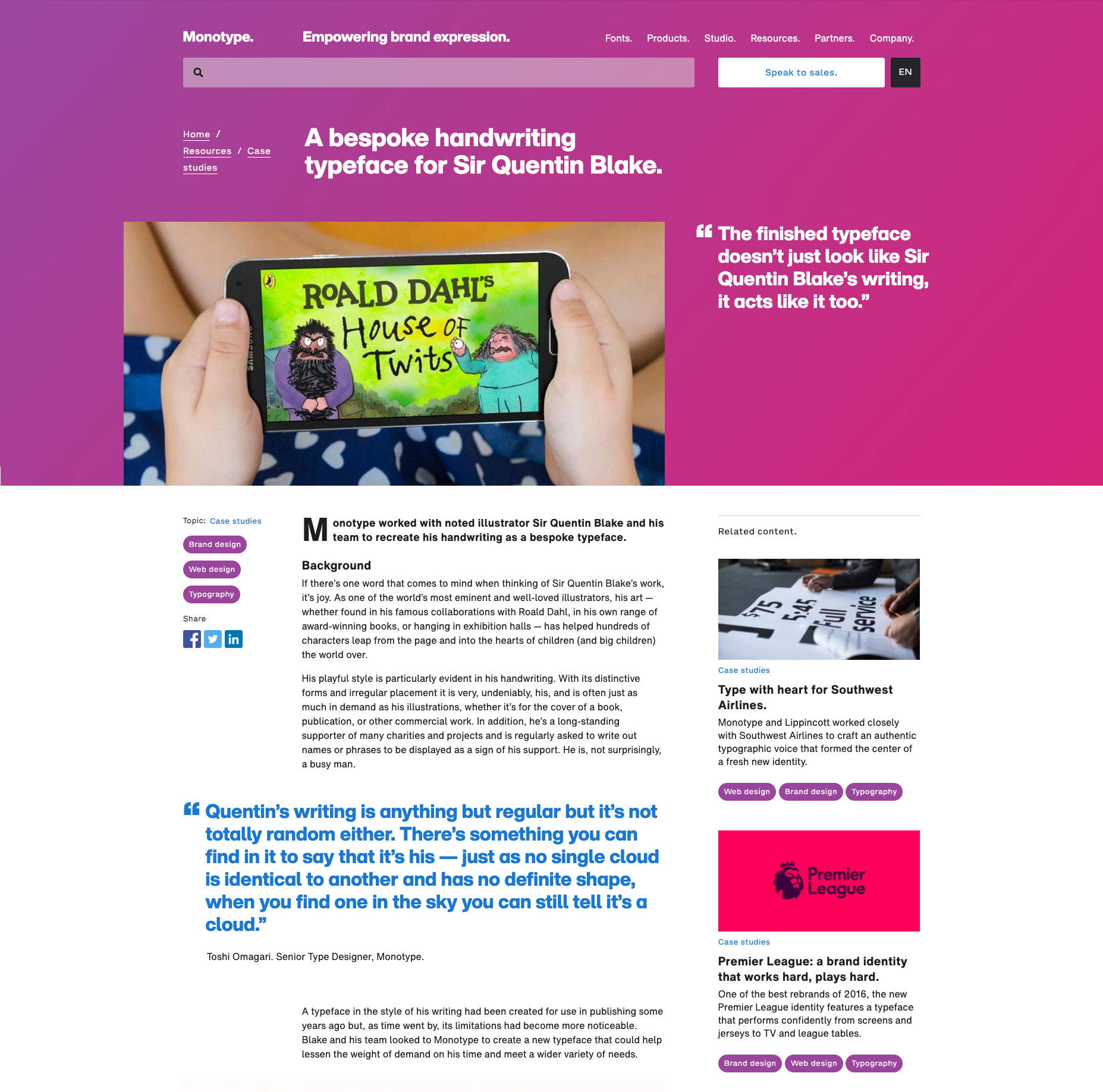
Monotype dot com
I was the lead designer for the corporate website over six years, evolving the existing design language and then implementing a full redesign as part of a new company brand in 2019.
Overview
The company behind type
Monotype is a type foundry and home to one of the world’s largest and most comprehensive collection of typefaces. It owns historically significant typefaces such as Helvetica and Gill Sans and new contemporary font releases like Masqualero and Posterama. It also provides design products, technology and expertise that help brands create beautiful, authentic experiences.
I joined the company after the design studio I worked for was acquired in 2014. We then formed the company’s in-house digital design team.
The challenge
Make type ‘the thing’
When we began work on the project there was already an initial site design, created by an external agency. It was our initial responsibility to work with the agency to develop this design and launch the site. Once the corporate site was established we needed to ensure that the new design language was adopted across all digital touchpoints. Monotype had a lot of disparate websites and products built on many different platforms. We had to both create and maintain a new digital design language and effectively communicate it to the rest of the company. We knew it had to be easy to use to be successful, otherwise disconnected work would carry on as before.
With the 2019 re-brand, we started from a stronger position as the underlying patterns and components were already in place. Also, UX designers from across all products were finally working together in the same team. The challenge this time was implementing the new branding across, not only the digital touchpoints but into the products that up until now had all been developed in isolation. Now we had the opportunity to audit and redesign everything we wanted the digital brand to be as consistent as possible.
The audience
Creative minds and authentic brands
Monotype’s audience ranged from independent freelancers and agencies, right up to global companies. Users visited the corporate site to discover how the company could help them purchase a single font, subscribe to a product, read expertise or even commission a bespoke typeface for their brand.
My role
When we joined Monotype they were already working with the agency, Information Architects to create a new company website that elevated Monotype to the experts in type. We worked alongside them to deliver the new site that launched later the same year. After that, I took over as lead designer for the project from 2015 to 2020. Over that time I had design, research and front end development responsibilities.
How we got there
A scalable design system
The most important element to any design work for a foundry is typography, in both iterations of the website we ensured that the type was bold, with more emphasis on it even than imagery which is so often the focus of most websites. We used Malabar and Kootenay in the first design, and Monotype’s bespoke cut of Helvetica Now in the redesign.
We also had to ensure that any work produced was available to be reused across the company. To ensure this was possible we abstracted the patterns and expanded the library into a full design system making it available to users where they were working through tools and documentation.
Outcomes and learnings
Bringing the world’s words to page and screen
The first iteration of the website was featured in the Creative Review, Annual in 2016 and took home a Gold in the European Design Awards. It was at the heart of the company’s digital presence and its influence permeated through the rest of the digital products.
The redesign was an even greater step in achieving a consistent online brand experience. This time I worked with product and digital commerce teams to create the foundations for a cohesive user experience. The work I put into creating a strong base of patterns for editorial articles allowed me to translate patterns and elements over to the MyFonts website so they were able to publish their own long-form content.


